by Dane Woodruff COMM 130
Introduction:

In search of an advertisement for my school research on the 5 elements of design, I came across an ad from the Yellow Pages that did a fantastic job in using these design elements. I found it on Pinterest at https://www.pinterest.ca/pin/90846117453953553/. The 5 elements of design are contrast, repetition, alignment, proximity, and color. Here are the findings on this great ad.
Contrast:

This ad screams with contrast, the most obvious one is the bright yellow dart against the dark, shadowy left side of the dart. Even within the dart there is contrast with the dart itself and the black lettering, making the words stand out so that you clearly know who the ad is from. There is even contrast of environment on side side of the dart than the other side. The left side is dark with people seemingly dealing with a problem. The right side of the dark portrays a bright carefree nature. This subliminally suggests that the Yellow Pages will make life rosy and bright for you with their help. The sky even contrasts as there is conflict with orderly perspective on the left and chaotic flora on the right. And finally, the white logo stands out near the center to set the focal point for the viewer eyes.
Repetition:

Here, repetition serves a function in this ad. The repetitive and diminishing perspective of the columns and windows give off the effect of endless city, but the dart still manages to hit its target. The yellow plays an interesting role in causing movement around the ad. The dart tend to move your eyes diagonally downward and off the page. Then the yellow poster on the left move your eyes back around to the yellow crosses on the safety vests, then to the yellow truck, and then back to the dart. This circular activity will have you reading the ad over and over. (which is what advertisers want)
Alignment:

With the lettering aligned with the dart, you understand that the lettering belongs to the dart. It actually defines the dart and tells the story for this ad. The dart itself, being out of alignment and disproportional, turns this scenario into surrealism in an instant.
Proximity:
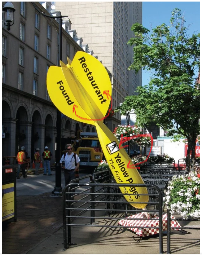
With the two words grouped at the tail of the dart, you see that they form a short and simple message, which explains the purpose for the dart. The Yellow Pages in approximation over The Find Engine tells you that The Find Engine defines what the Yellow Pages is. The Yellow Pages besides the logo establishes its relationship with each other.
Color:

Here, the use of primary and secondary colors shows the color of everyday life ( with the exception of the giant yellow dart). The recognizable shade of yellow on the dart form a subtle repetition with the logo and lettering that tells you who the company is.
Conclusion:
All in all, the design elements of this ad really make it a surreal work of art by giving you a ton of advertisement with only 7 words. Everything else tells the story of how the Yellow Pages can be a source of finding places, whether remote or impossible to find. The use contrast, especially, has made this ad a design masterpiece.
