by Dane Woodruff COMM 130
My critique of Smithsonian Magazine’s design elements.

I was set out this time to find a magazine to critique for certain design elements. I was kind of concerned about this assignment because I don’t see people going around with magazines in their hand. That has been replaced with the latest cell phone and TikTok-like apps that leave the archaic magazines in the dust. So, I concluded magazines sold their soul and went electronic, or in other words, you’ll find them online. I came across this one and was about to click away from it, but there was something about it that bugged me. I now had to investigate.
Depth of field

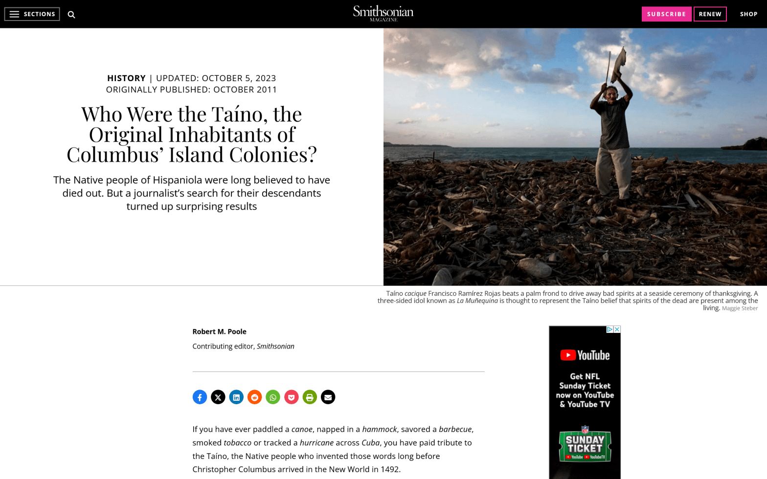
The first thing that caught my eye was the striking field of depth which contrasted and brought that insignificant looking man out of obscurity and made him the focus of the subject matter. He was even positioned somewhat in the rule of thirds. I also noticed that everything in the column has a center-alignment. Oh wait! The main body of the paragraph (not fully shown) has a left-alignment, but a thin black ad pops up on the right, off-setting the left-alignment and making it feel central again. My bad. So what was bugging me about this layout? I even created three photos to match the power of this photo’s field of depth. My amateurism shows compared to the photographer who took that picture. (all pictures were shot from my Samsung Galaxy S10 phone)

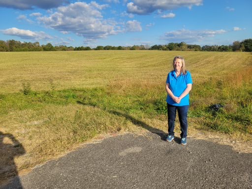
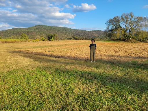
Although my photographs are a bit amateurish, you can still see the power of field of depth accomplishing the task of bringing the subject to become the focal point.
Typography:
So, if the magazine layout is okay and the image is good, perhaps what is bugging me is in the typography.

I see that there is good contrast between the title (which seems composed of the tall Modern type “Book Antigua” against what appears to be the squat San Serif “MS P Gothic.” I immediately know what the title is, even being sandwiched between two plain text lines. Even the “Smithsonian Magazine” logo has good contrast and a daring move in using all caps for the smaller text. But in further noticing the logo, it hit me as to what is bugging me.
Conclusion
Although everything looks good with the execution of this design, what stands out is the logo’s lack of “standing out”. It dwarfs almost into obscurity in the top center. Also, the only stand-out colors besides the images are on the links to somewhere else. It leaves me with this taste in my mouth that Smithsonian is not serious about promoting itself. The Smithsonian Institute has always been about some serious science and other interesting subject matter. Shouldn’t that reflect on their magazine design? Maybe they are just being modest. Seriously!
