Searching for an ad to redesign for my class project, I scanned quickly through the internet in search of a spark of inspiration. Of course, there is a sea of products to choose from. I hoped I wouldn’t have a hard time picking one out. It wasn’t long until my eyes fell upon a familiar commodity that I knew would be a great product whose ads would be great to redesign. It’s good ol’ familiar Clorox.
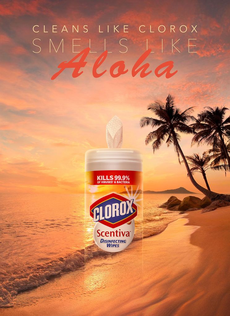
I simply saw the ad on Pinterest, of all places, and was immediately caught by the phrase “Works like Clorox, smells like ALOHA!’ [insert image] …. What?! That was a weird way at putting words. After about a minute of processing in my mind, trying to understand the phrase, it came to me as I played it out in my mind of using Clorox. It works like Clorox is known to work, but you don’t get that distinctive chlorine smells on your laundry that has become synonymous with bleach.
I knew from that point on that this ad was what I wanted to recreate. This ad was created for the average person who uses bleach, which is about everyone. As I said before, I got this ad from Pinterest, so I don’t know the designer who created the ad, but I like his or her thought. Whoever thought up this ad decided to use a little discretion when it comes to addressing its issue – which is its smell. That person knows that there is no “un-crass” way to say, “Hey! we made fart smell like lilac!” Of course, I am not saying the smell of the gas chlorine is comparable to the smell of the gas methane, but I believe you get the metaphor.
Contrast
As I went about trying to formulate ways to redesign this ad, I noticed the key elements to design – that is contrast, repetition, alignment, and proximity. I make it an acronym of C.A.R.P. for carp, which could mean fussing over details. It’s not the greatest of acronyms, but I like it far better than C.R.A.P.! Getting back on point, the typography uses contrast to set apart each line of phrase, from size changes, to font and color changes that immediately tell how the phrase is supposed to be said. The shine from behind the mostly transparent bottle distinguishes and shapes it so that you get the illusion of a bottle and that it really stands out even though it is supposed to blend in with the scene. Clever.
Repetition
There is even a small design element of repetition in this ad. Aloha and the background repeat to give you a sense of Polynesia and the shine from the bottle and the shine from the logo highlight its recipients respectively. This also makes it the centerpiece of the whole ad. The whole background is in sync with the Aloha text that gives off the warm tropical feel.
Alignment
Every bit of the text is center-aligned so that your eyes stay right in the middle. This helps to locate the vanishing bottle and more importantly, the Clorox logo. Speaking of the logo, it is aligned with the rule of thirds position. I’m not sure if that was instinctively done that way, but it does seem to work with keeping my eyes there.
Proximity
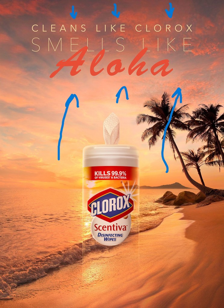
As far as proximity goes, everything in this ad naturally clusters with its own kind, the slogan stays of in its space in the upper middle. the logo and its information stays confined on the bottle. Proximity in this ad keeps things simple and logical. I see that the slogan bunched all its words at the top so that the rest of the ad is more about the experience than words. I believe this helps to keep things discrete. Can you smell it now?
in Conclusion
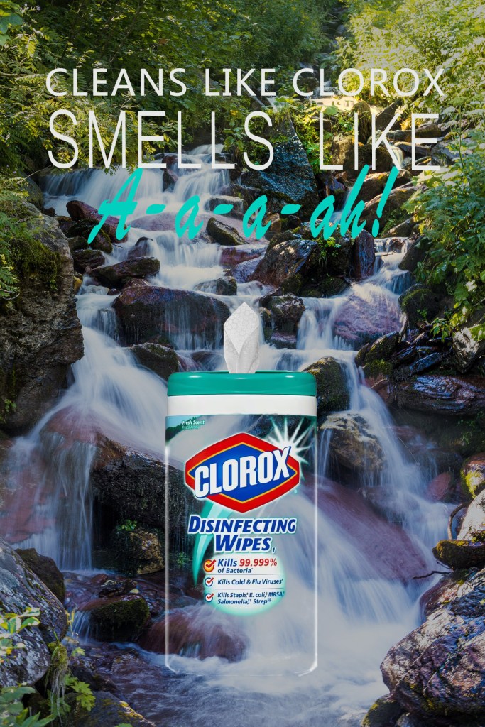
I transferred all of those qualities over into my redesigned ad with the difference in repetition. My repetition is in the meaning of “fresh”. There is freshness in the word “A-a-a-ah!”, there is freshness background and in the coloring. Although this ad presents a different mood, it presents the same discretion and purpose. That is what the advertiser wants – variety. I believe I accomplished the task of recreating an ad that I think that the Clorox Corporation would use in its arsenal of ads.
